— OVERVIEW
A case study from the Master Interface Design Bootcamp by Aela.io
— ROLE
UX Researcher
UI Designer
— DATE
May/2021
Challenge
Despite the rise of online courses in 2020 which providers gained over 60 million learners combined, monthly visits in Udacity's landing page decreased by 8.19% in March/2021, according to Crunchbase.
Solution
To better understand the reasons behind the reduced number of visits, secondary research was conducted to bring some insights that led to new ideas that could raise this number.
Project goal
The main goal of this project is to find solutions that improve the landing page performance and increase the visits and conversion rates.
Methodology
The Double Diamond framework was used as a guide throughout the project.

DISCOVER
Understanding the context
Comparing numbers
Using Crunchbase to extract engagement and conversion rates from Udacity's and their competitor's landing pages, it was found that Udacity's page has the lowest number of monthly visits and the highest bounce rate compared to the main competitors (Coursera, Udemy, and EdX). Udacity also has the highest decrease in visit duration.

Pain Points
From B2C to B2B
Best known as an online course provider, Udacity raised $75M in debt after years of investing in direct-to-consumer products. Udacity's CEO Gabe Dalporto says the company is looking forward to reaching businesses and governments due to profit opportunities.
Customer's pain points and expectations
User comments in forums such as Reddit and Quora related to Udacity revealed that:
• The courses are too expensive;
• Some courses are outdated;
• The quality of mentorship services and project feedbacks has dropped.
Overall, the users were expecting competitive advantages due to high course fees. Since they are focused on the tech market, they expect updated courses and the best guidance from industry leaders.
"There is no more personalized mentorship. Students go online to ask questions. I'm not complaining, but I think given the high fees, students do deserve additional help beyond what is standard in other MOOCs that charge significantly lower prices."
Student feedback from Reddit.
DEFINE
Shaping project problem
Proto-persona
After analyzing customers' reviews and detecting their pain points and expectations, a proto-persona was created based on their goals, fears, wants, and needs:

Laws of UX
Landing Page analysis
Using the laws of UX to check if the landing page communicates all the features successfully, we saw some of the principles not being followed and could impact page performance negatively:
1. HICK'S LAW
"The time it takes to make a decision increases with the number and complexity of choices."
Too many options are presented to the user and could confuse them in decision-making situations.
2. MILLER'S LAW
"The average person can only keep 7 (plus or minus 2) items in their working memory."
The process of searching for specific courses has too many steps, so it demands great cognitive effort.
3. VON RESTORFF EFFECT
"When multiple similar objects are present, the one that differs from the rest is most likely to be remembered."
Many of the contents are inside cards that are similar to each other. The only elements that differ from the rest are sections that aren't important for conversion purposes.
4. PEAK-END RULE
"People judge an experience largely based on how they felt at its peak and its end, rather than the total sum or average of every moment of the experience."
The price is presented to the consumer too soon. The sequence of information doesn't construct product storytelling where the advantages come first to justify the course fees.

According to the 2020 Randstad Workmonitor Report, most people believe upskilling is a shared responsibility with employers and employees. However, the vast majority admit that they take the initiative themselves to stay up to date.
Despite the increasing number of enterprises associating with course providers to upskill their teams, individual initiative is still the majority of the target audience. Most of Udacity's competitors communicate with both B2C and B2B consumers.

Project Hypothesis:
Enhancing user journey and page contents would improve consumer's perceived value of the courses. Hence, Udacity wouldn't need to abandon direct-to-consumer products.

DEVELOP
Creating solutions for the problem
Reordering and rewriting contents
This step refers to the copywriting part of the landing page. Some contents had to be moved or changed to enhance the product value perception.
1. Problem: Use of academic language, distant from consumers' goals (entering the labor market, receiving better job offers)
Solution: Use expressions that are closer to the audience (example: "syllabus" to "schedule").
2. Problem: Lots of links showed in multiple ways, which can distract the user from clicking the call-to-action button that converts them into leads
Solution: Reduce the number of links and making call-to-actions more visible.
3. Problem: Repeated content that makes the page longer with no purpose
Solution: Contents that are clear, concise, and guide the visitor to enroll in the course.
4. Problem: The filters in the program catalog are overly specific, creating too many categories inside a dropdown menu. Besides, right below the filters, there is a list of course names which makes the search bar useless.
Solution: Unite similar categories into one and create a checkbox list instead of a dropdown menu.

User Flow
A search bar and a call-to-action button below the featured courses were added to the landing page to improve the enrollment experience.


Wireframes
The redesigned wireframes have delimited structures to each content, which makes it easier to highlight important information. To achieve this result, it has the following items:
• Search bar in the header for easy access to the course catalog;
• Different number of columns in each section;
• More space for icons and photos;
• Distinctive text styles for titles, subtitles, buttons, and links;
• Clearer call-to-action buttons.

DELIVER
Putting the
hypothesis
into practice
Style Guide
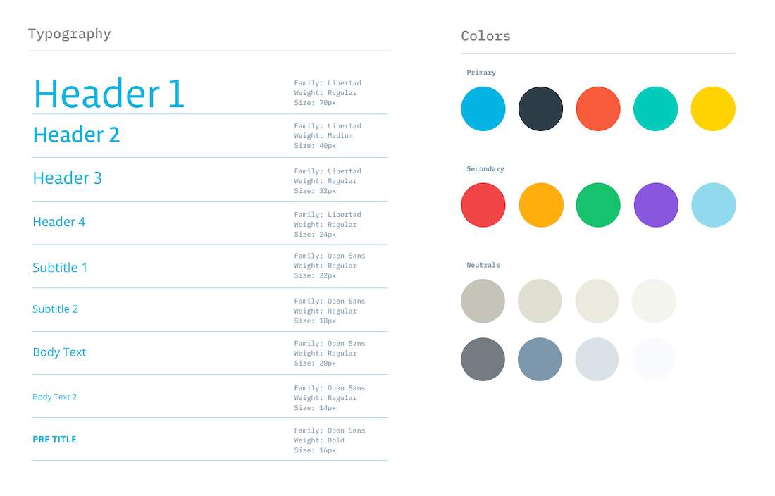
Style Guide – Typography and colors
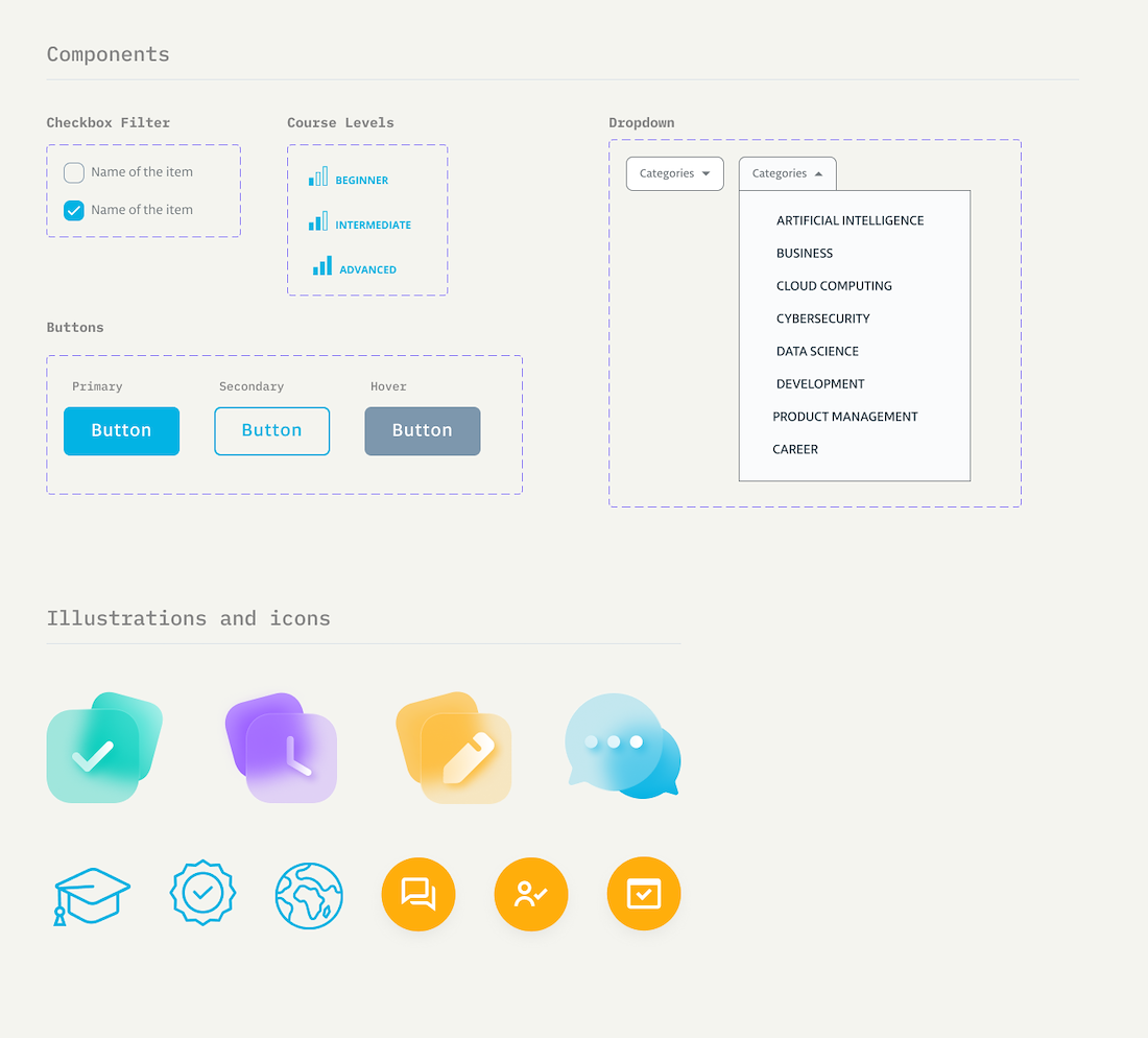
Style Guide – Components and icons
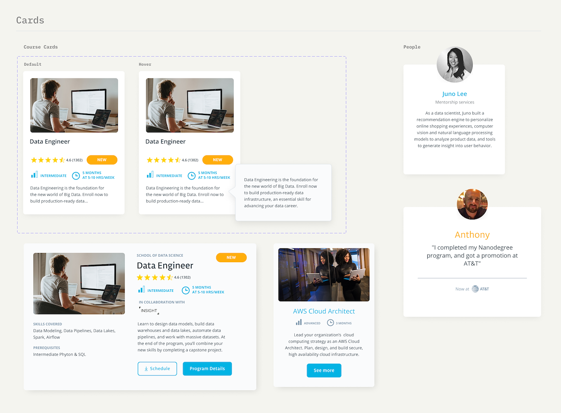
Style Guide – Cards
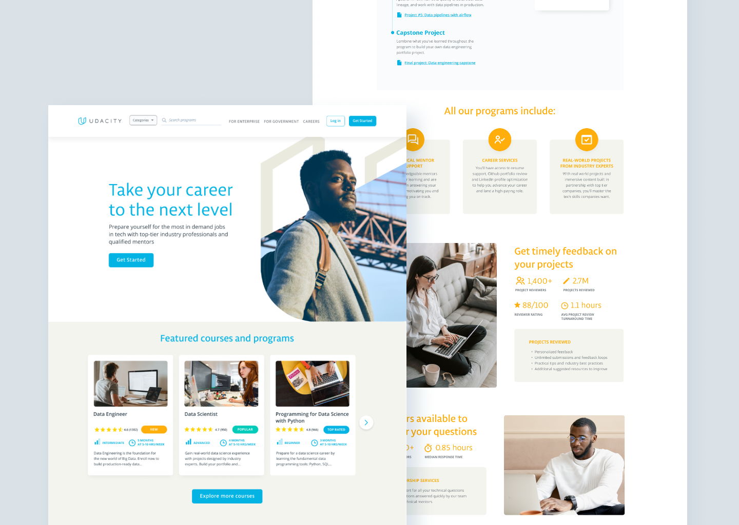
Final UI
After structuring the wireframes, the UI elements started shaping the landing page according to the brand guidelines. Colors and typography would have a crucial role in the content distinction.
Landing Page (before/after)


Program Catalog (before/after)


Course Page (before/after)


Student Stories (before/after)


Create account/Log in (before/after)


Prototype
What I've learned from this project
The most important lesson I've learned from this project is to listen to different points of view before making a decision. I found Udacity's CEO interview in the first place, and I thought I should focus on business and government clients. But with further research, I found out that B2C consumers were having issues with the courses and how it could reflect on Udacity's sales and reputation.
Another thing that I've learned is the importance of iteration. I was constantly detaching from my initial ideas as I was researching for new information, which opened new paths to different solutions.