Industry
Fintech U.S.
Client
Data Center Inc.
Year
2024
Project Time
1 month


Context
DCI (Data Center Inc.) is a leading provider of banking technology and services, with nearly 60 years of experience supporting community banks across the United States. The company provides digital solutions and manages operations for more than 200 community banks nationwide.
GoBanking is a fully customizable online banking platform that enables community banks to provide essential financial services such as transfers, account management, and debit card operations through an intuitive and user-friendly experience.
My Role
As a Product Designer, I joined the GoBanking team to optimize the handoff process, maintain visual consistency, and accelerate the end-to-end workflow by introducing frameworks and best practices that improved problem-solving efficiency. This case highlights one of the user flows I contributed to.
Problem
DCI’s client banks were experiencing a high volume of customer support calls regarding one of the app’s most critical features: transfers. Due to a fragmented, unintuitive transfer flow, users often struggled to schedule or complete both internal and external transfers, leading to frustration and increased demand for support and training.
Solution
We redesigned the entire money transfer process of the legacy app by introducing quick actions and intuitive touchpoints that made it easier for users to find and access the feature. We also surfaced key information directly within the transfer forms, allowing users to complete transactions seamlessly without leaving the page.
Framework
To identify pain points and issues, we established a workflow that enabled us to design features that were clear, focused, and directly addressed user needs:
Client Interviews
Engaged with multiple banks to uncover their challenges and expectations, focusing on understanding the customer experience from their point of view.
Functionality Mapping
Documented the entire transfer flow: its features, components, interfaces, and customization options. A heuristic evaluation was also carried out to pinpoint usability issues and guide systematic improvements in the redesign.
Desk Research
Conducted in-depth desk research to analyze the distinct characteristics of community banks compared to major institutions such as Chase, Bank of America, and Wells Fargo, as well as the behaviors and expectations of their customers.
Benchmarking
Examined both direct and indirect competitors to identify best practices, interface patterns, and opportunities for differentiation.
Redesign
Collaborated closely with DCI’s development team in agile sprints to refine screens, streamline workflows, and modernize the overall user experience.
Usability Testing
To ensure the new features met user needs, we conducted usability testing to gather feedback and identify improvements before handing the designs off to the development team.
Client Interviews
To uncover the main pain points experienced by customers using the transfer flow, we conducted interviews with representatives from multiple community banks. The feedback revealed recurring usability challenges and opportunities for improvement. The main issues identified were:
Complex Transfer Setup
Clients described the transfer setup, especially for external and recurring transfers, as confusing and unintuitive. Users often struggled to understand the required steps or terminology and were unsure whether their transfers were successfully scheduled.
Recurring Transfers Reliability
Several institutions reported that recurring or scheduled transfers frequently failed or did not process as expected. This inconsistency led to client frustration and additional support requests.
Accessibility Limitations
Participants highlighted the need for better accessibility features such as larger fonts, higher contrast, and improved usability on mobile devices, particularly for older users and those with limited digital literacy.
Lack of Balance Visibility
Users had to leave the transfer screen to check their account balance, interrupting their flow. They requested a more integrated view where balances are visible during transfer setup to reduce confusion and prevent overdrafts.
Unclear Notifications and Feedback
Clients received generic or excessive notifications with little actionable detail. They expressed the need for more informative messages confirming successful, failed, or pending transfers.
Fragmented Navigation
Users reported that navigating across multiple sections to complete a transfer was inefficient and time-consuming. They expressed a need for a more streamlined, intuitive flow with fewer steps and clearer on-screen guidance.
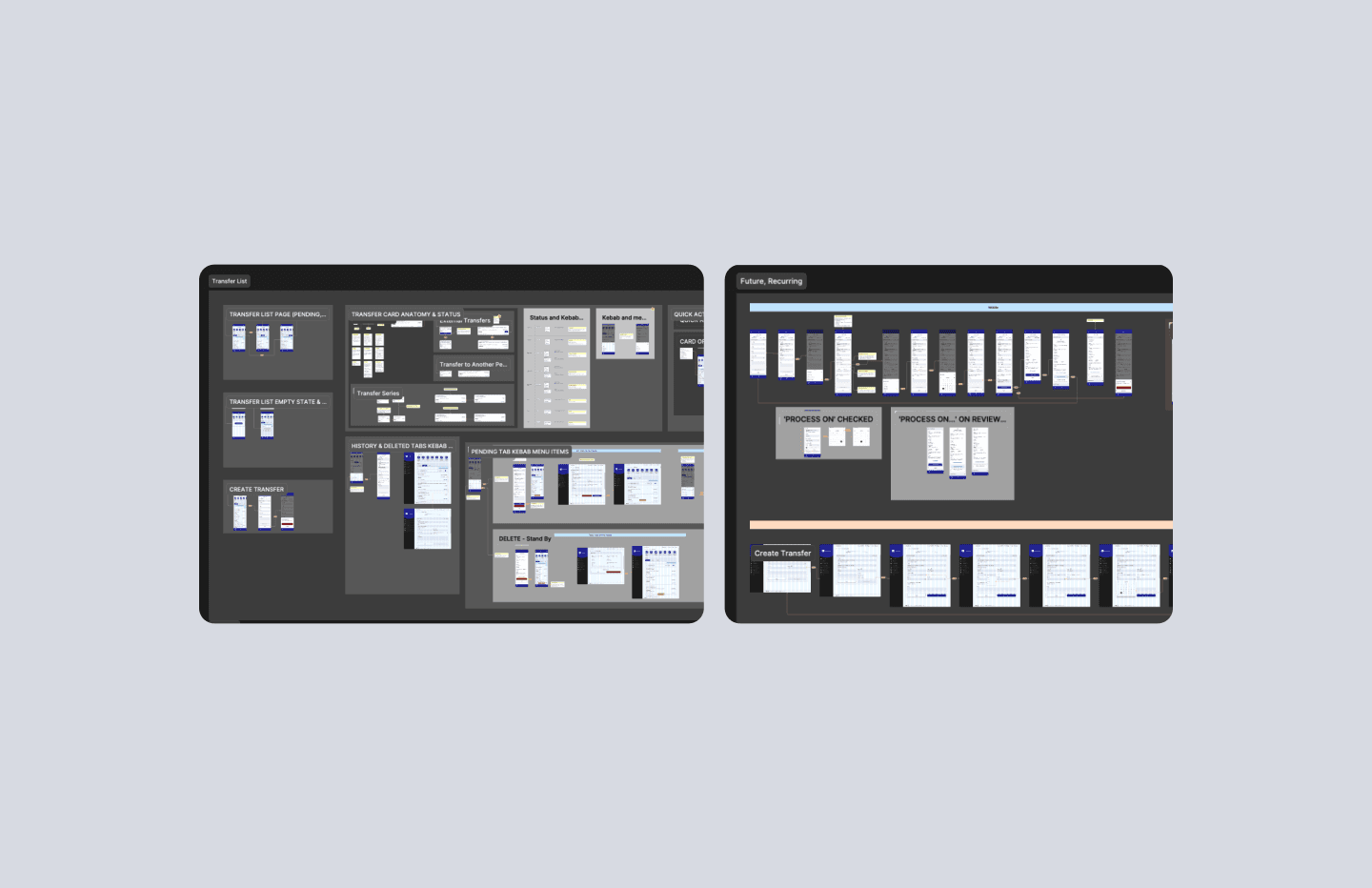
Functionality Mapping
After collecting feedback, we analyzed the current app to map all existing features and identify gaps in user navigation. A heuristic evaluation was also conducted to uncover usability issues and opportunities for improvement.
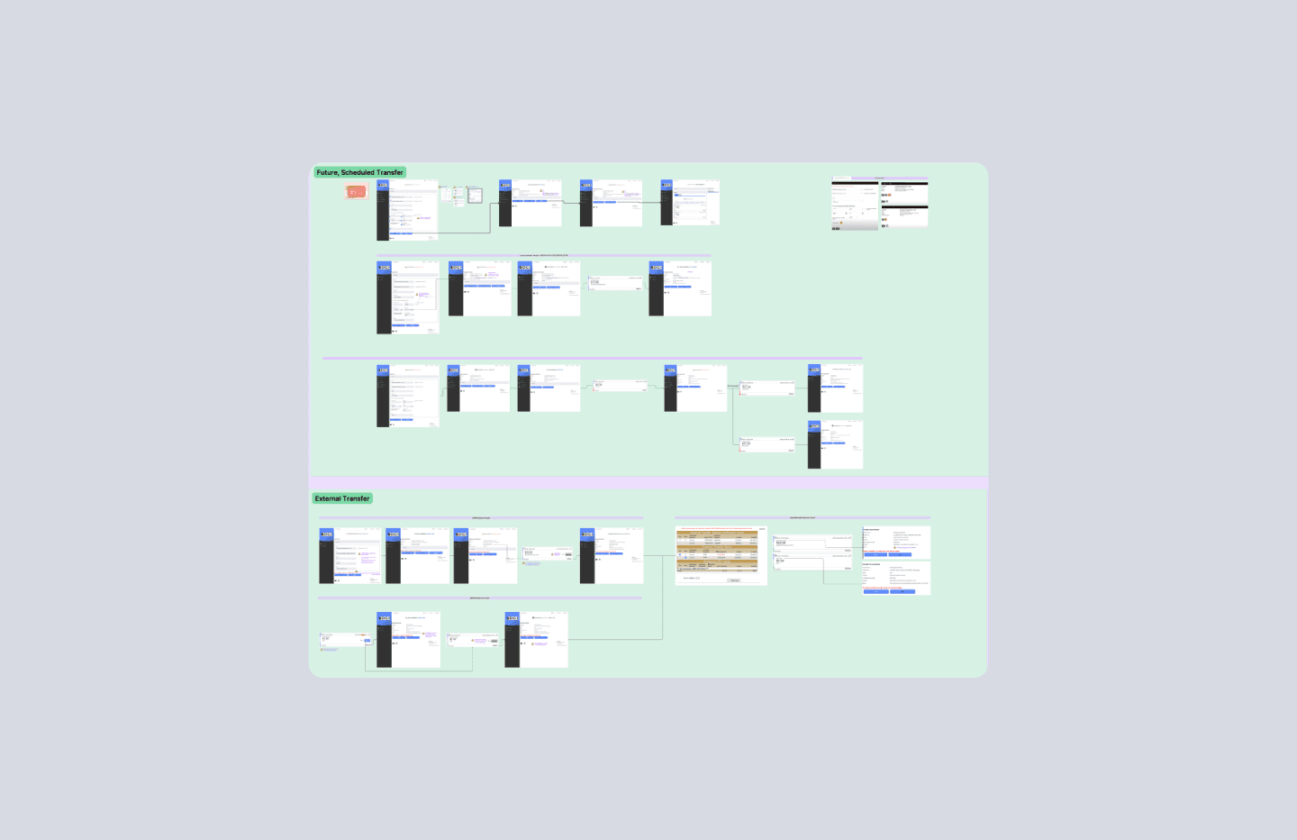
An example of the current scheduling and external transfer flows, two critical areas we focused on improving. The main issues were evident: crucial information was hidden or not properly highlighted, scattered information, and a lack of user feedback.
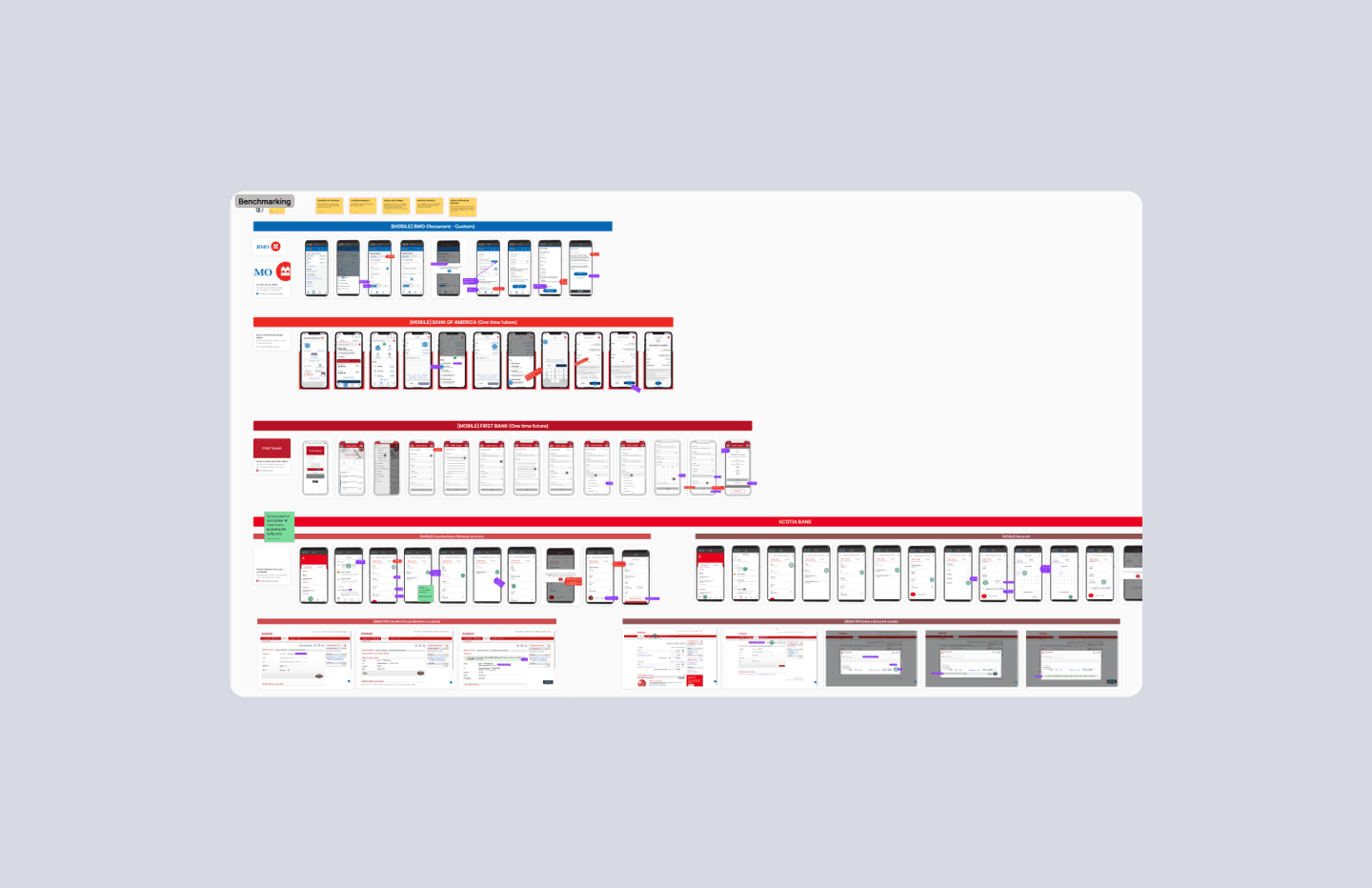
Desk Research & Benchmarking
To ensure alignment with industry standards and consistent terminology, we conducted a benchmarking analysis of traditional banks such as Bank of America, Chase, and BMO, along with several community banks.
Redesign
The design process included the implementation of the following improvements:

1.
Quick Actions for Streamlined Access
Placed key actions at the top of the page to simplify navigation within the transfer process. This enhancement reduces users’ cognitive load and improves discoverability of related features, such as external account setup and Bill Pay.
2.
Redesigned Transfer Cards with Clear Status Indicators
Enhanced transfer visibility through redesigned cards that display real-time status updates. This improvement reduces uncertainty and reassures users that transfers have been successfully completed.
3.
Enhanced Component Design
Increased the font size and clickable areas of core components to improve readability and reduce interaction errors. These adjustments provide users with greater precision and accessibility during transfers.
4.
Inline Balance Display
Integrated account balance information directly within the helper text field. Once an account is selected, the balance appears automatically, eliminating the need for users to navigate away from the transfer page.
5.
Feedback and Review Page
Introduced confirmation and review states that provide clear feedback after transfer completion. These updates increase user confidence by confirming that transactions were successfully processed.
6.
Refined UX Writing
Adopted industry-standard terminology and clearer microcopy across the transfer flow, especially for transfer frequency. This improvement ensures users understand each step and feel guided throughout the process.
Usability Testing
After designing the improvements, we conducted usability testing with 5 participants from DCI’s client banks, covering 9 different tasks. The key results were:
89% of tasks successfully completed
Only one task required adjustments related to highlighting important information, which was later refined.
All users found the updated features easy to use
Overall feedback was highly positive: participants described the design as cleaner, more intuitive, and easier to navigate. They appreciated having everything consolidated in one place and noted that the flow felt smoother, with no significant points of friction. They also believed the updates would help clients complete daily tasks more quickly and efficiently.
Additional Feedback
Although the test was successful, we encouraged users to share further suggestions for improvement, and those insights were later incorporated into the final design.
Handoff
After refining the flow, we prepared a comprehensive handoff for developers, including detailed specs and business rules to ensure a smooth implementation.
Example of the handoff page, showing both Desktop and Mobile screens, along with detailed descriptions of the cards, their statuses, and how each one behaves in different scenarios.
Results
As consultants, we weren’t able to measure the direct impact of the transfer flow redesign, but the solution received strong approval from the banks. Still, there are key metrics we would like to track in the future:
Number of completed transfers
To understand whether the improvements led to higher conversion and successful transactions.
Number of calls to customer support
To assess whether users became more independent when performing transfers.
Average transfer time
To determine whether the updates made the process faster and increased overall productivity.
What I've Learned
Working in Design Sprints
Because this project was heavily design-driven, we adopted the Design Sprint methodology to validate hypotheses and iterate more quickly.
Collaborating With an External Development Team
We learned how to effectively collaborate with a development team based entirely in the U.S., which required tailoring our handoff process to fit their workflow and expectations.
Engaging Clients Throughout the Process
By interviewing clients and involving them in usability testing, we gained clearer insights into their needs and saw firsthand the impact of our improvements.

